Make Tails better, and get the job
We’re hiring a product designer. Instead of a take-home brief, here is our own app: five screens from Tails for iOS, what each one is for, and why it looks the way it does. Show us what you would change.
-
Pick a screen or a flow
Any of the five below, or a flow that runs across them, like a walk from start to the feed.
-
Criticize the design and the product
Tell us what doesn’t work and for whom. Disagree with our decisions. Question what we built, not only how it looks.
-
Send your draft and why
A mock, a sketch or a prototype, with the reasoning behind it. Rough is fine. The why matters most.
Family feed
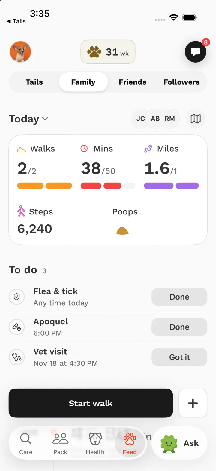
“Has she been walked today, does she need anything, and who is on it?”
Family is the household’s shared view of one dog’s day. Everyone who walks her sees the same page, so the page has to settle the questions people used to text each other.
What’s on the screen
- Audience switch: Tails, Family, Friends, Followers.
- Today card: Walks, Minutes and Miles fill rails toward today’s goal, then Steps and the day’s poops.
- To do: care reminders in one list, in the order they are due, each with one tap to finish.
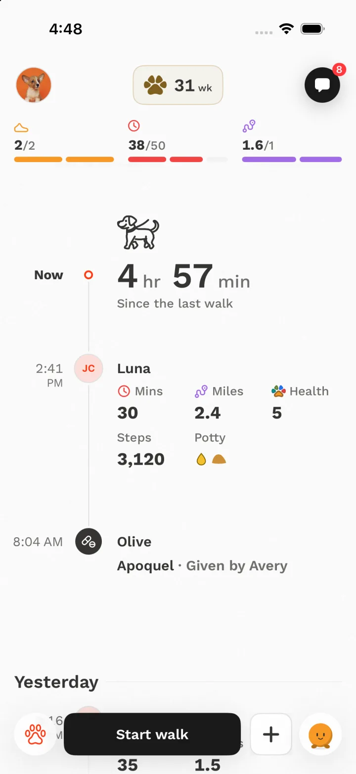
- Now: a walking dog over the time since the last walk.
- The day’s timeline: walks and potty breaks on one vertical line, newest first.
- The walk dock: Start walk and + (log a poop or a pee) in the same dock as the Health tab.
Decisions
-
Today before the month
An earlier Family led with a month chart, so the first screen held no walks at all. The household checks the dog several times a day, so the page opens on today and its goals. Walks and Minutes against the goal stayed through every round because they answer “did she get enough?” at a glance.
Tried and dropped: A month climb as the hero. Three competing heroes (a timer, a big figure and a chart) on one screen.
-
A timer instead of a nag
“4 hr 50 min since the last walk” sits where the day’s timeline begins. It tells everyone whether she needs to go out without a notification telling them to. It is the most useful fact on the page for deciding what to do next.
-
One vertical day, with the walker at the end of the row
Walks and potty breaks share one line, so the day reads top to bottom like a calendar. The walker’s face sits at the end of each row, so their name is not repeated. The dog stays the subject, and the person is the detail.
Tried and dropped: A horizontal day ribbon, which repeated the list under it. Splitting the day by person, which lost the dog. A hydrant icon for pee, which read as a red Christmas tree, so pee became a yellow drop.
-
Every walk shows what it did for her health
Each walk row carries a Health figure (“Health 5”): that walk’s real contribution to her Health Score, printed beside minutes and miles. The score itself stays on Family and never appears on the Friends feed.
Tried and dropped: A chip for each measure on every walk (too busy). A bare score with no link to the walk (too subtle).
-
One dock, reused
Start walk and logging a poop live in the same floating dock as the Health tab, so the main action is always in the same place. When you log a poop from the dock, it flies into Today’s Poops, so you can see it landed.
Tried and dropped: Start walk and Invite as two equal buttons. The pair split the eye, and Invite moved into the header.
-
Goals pin on scroll
Once the Today card scrolls away, its three rails pin under the header in a compact bar. You can read back through the day without losing whether today is on track.
Friends feed
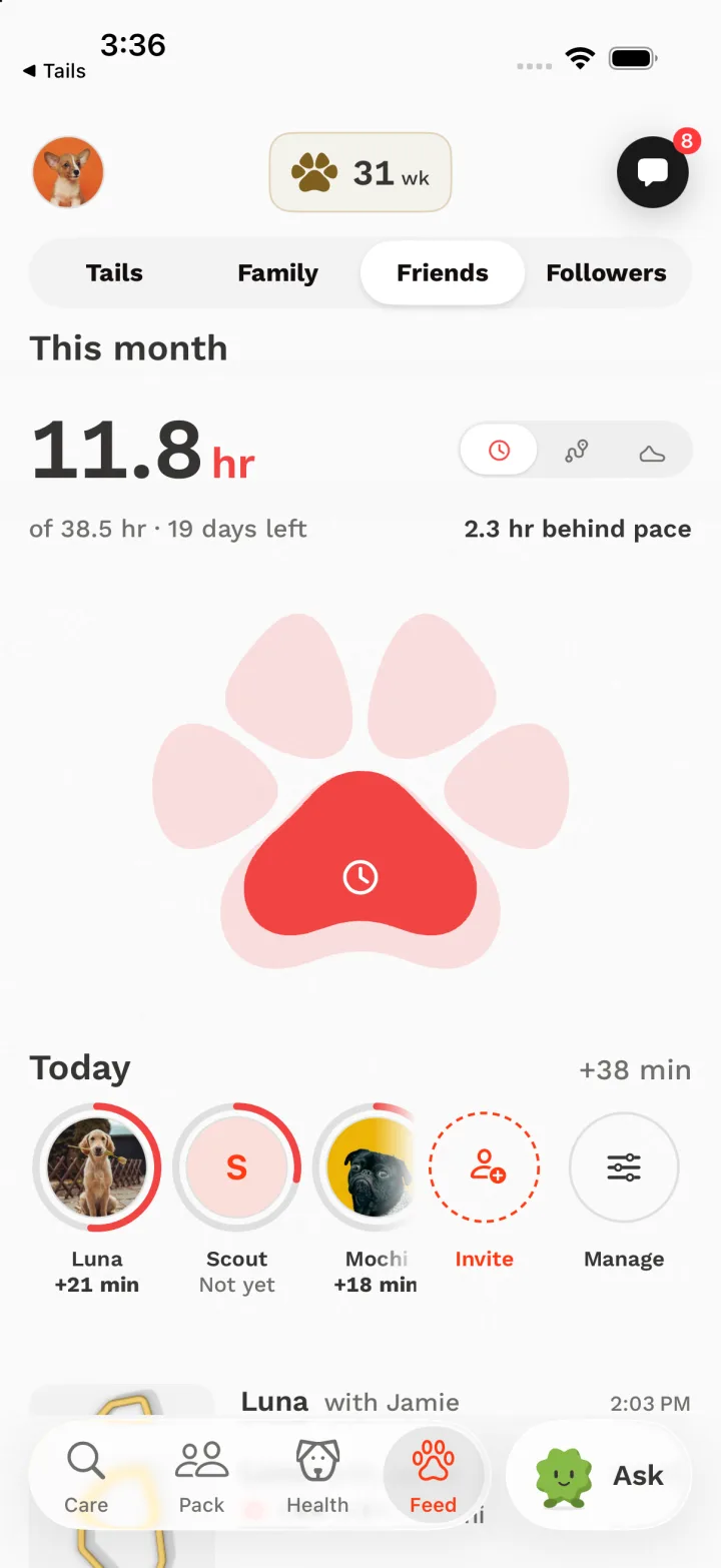
“How is our group doing on the goal we share this month, and who has walked today?”
Friends is walking together. Everyone’s walks add up to one shared monthly goal. Nobody is ranked here, because ranking turns friends into rivals and that belongs in Packs.
What’s on the screen
- This month: the group’s total, with a small Time, Distance or Walks switch beside it.
- The goal and the pace in words: “of 38.5 hr · 19 days left” and “2.3 hr behind pace”.
- A large paw that fills as the group nears the goal.
- Today: each dog’s face in a ring toward its own goal, with today’s minutes or “Not yet”, then Invite.
- The feed: walk routes with who walked, when, and boop, comment and share.
Decisions
-
The paw is the progress bar
The group goal fills our own icon. The main pad fills first, then the toes from left to right, by area, so a half-full paw really is half the goal. It replaced a stacked line chart, and it is the same paw that holds a dog’s health on the Health tab.
Tried and dropped: A plain progress bar and a ring. Both tested worse than the old chart: more clutter and less information. The paw then replaced the chart.
-
Pace in words, not just a number
“2.3 hr behind pace” answers the real question (are we going to make it?) without making anyone do maths on 11.8 of 38.5 with 19 days left.
-
One colour means the reading you picked
The paw, every ring and every gain share the colour of the selected reading: red for Time. Dogs are told apart by their faces, not by colours, so colour never means two things at once.
Tried and dropped: A colour per dog. It spent the palette on identity, and it clashed with the colours that already mean Minutes, Walks and Distance.
-
A row of faces that says who still needs to walk
The Today row is both the day’s summary and the chart’s legend. Each ring fills toward that dog’s own goal, and “Not yet” under a face nudges people more kindly than a reminder would. Past 100% the ring laps itself, as Apple’s Fitness rings do, with a cut-out end so the extra lap stays readable.
Tried and dropped: Thin rings (too faint at a glance) and a checkmark badge for a met goal (we used the lapping ring instead).
-
Invite is always on screen
A shared goal only works with people in it. Invite sits in the faces row and in the bar that pins when you scroll, so it is always in view.
Tried and dropped: A bottom Invite dock, which disappeared into the tab bar.
-
Design for routes, not photos
Most feed items are walk routes, not photos, so each row leads with a compact route model and a short statement. A feed built around big photos would be mostly empty boxes.
Health tab and Ask Tails
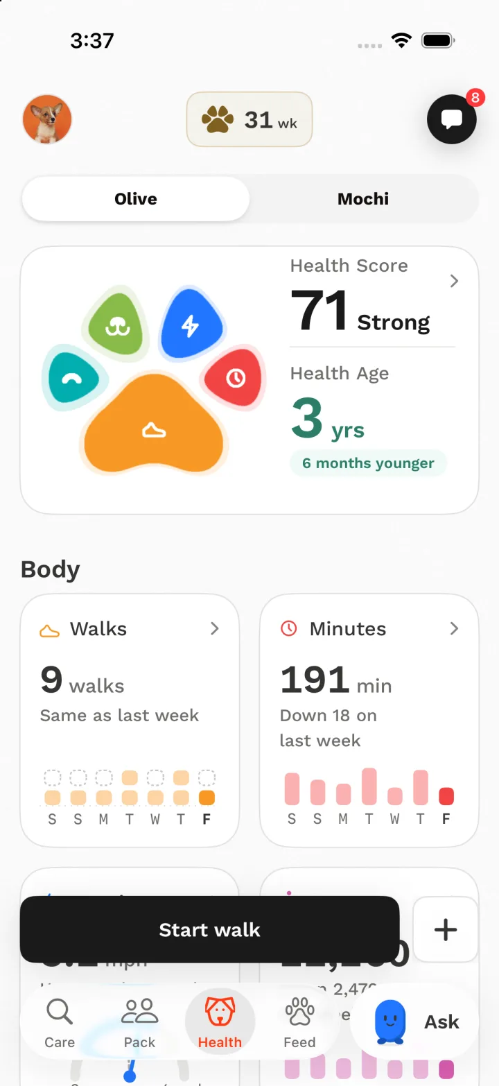
“How healthy is she this week, and where is she heading?”
The Health tab turns walks, poops and weight into a short summary a pet parent can read in a few seconds. Ask Tails answers the same question out loud, from her own data.
What’s on the screen
- A dog switch for households with more than one dog.
- The Health Paw: five pads for Walks, Minutes, Stamina, Sniffari (sniffing) and Poops, each filled by how she did this week.
- Beside it, this week’s Health Score and her Health Age, with how far it sits from her real age.
- Cards grouped as Body, Mind, and Gut & Shape, two to a row.
- Each card compares with last week in words (“Same as last week”, “Down 18 on last week”).
- Ask in the tab bar: one tap to talk to Tails about your dog.
Decisions
-
A summary page, like Apple’s Fitness
The old page put a switch under one chart, and people didn’t see that it was tappable. Now a hero sits on top, the measures follow as two-up cards, and tapping a card opens its full chart. Everyone already knows this pattern.
-
Health Score and Health Age are kept apart
Health Score is this week’s habit, and it moves with every walk. Health Age is the long-term trend. Mixing them would make a good week look like the dog got younger. The score sits in the hero, and tapping it opens the Health Age page.
-
Colour names a measure. It never grades it.
Minutes is always red, Walks always orange, Stamina blue, Sniffari green, Poops teal, on every screen including the live walk. Because red is just “Minutes”, it can’t also mean “bad”. Figures print in ink, and past days recede to a tint so today stands out.
-
A measure appears only once it means something
One shared rule decides when each card fills in: a few walks for Walks and Sniffari, a few logged poops for Poops. Before that, a card says what will fill it. A score we can’t compute yet shows a dash, never a zero that reads as a failing grade.
-
No internal words on screen
Inside the team we say signals, pillars and baselines. On screen it is walks, minutes, sniffing and poops, and comparisons are always to last week.
-
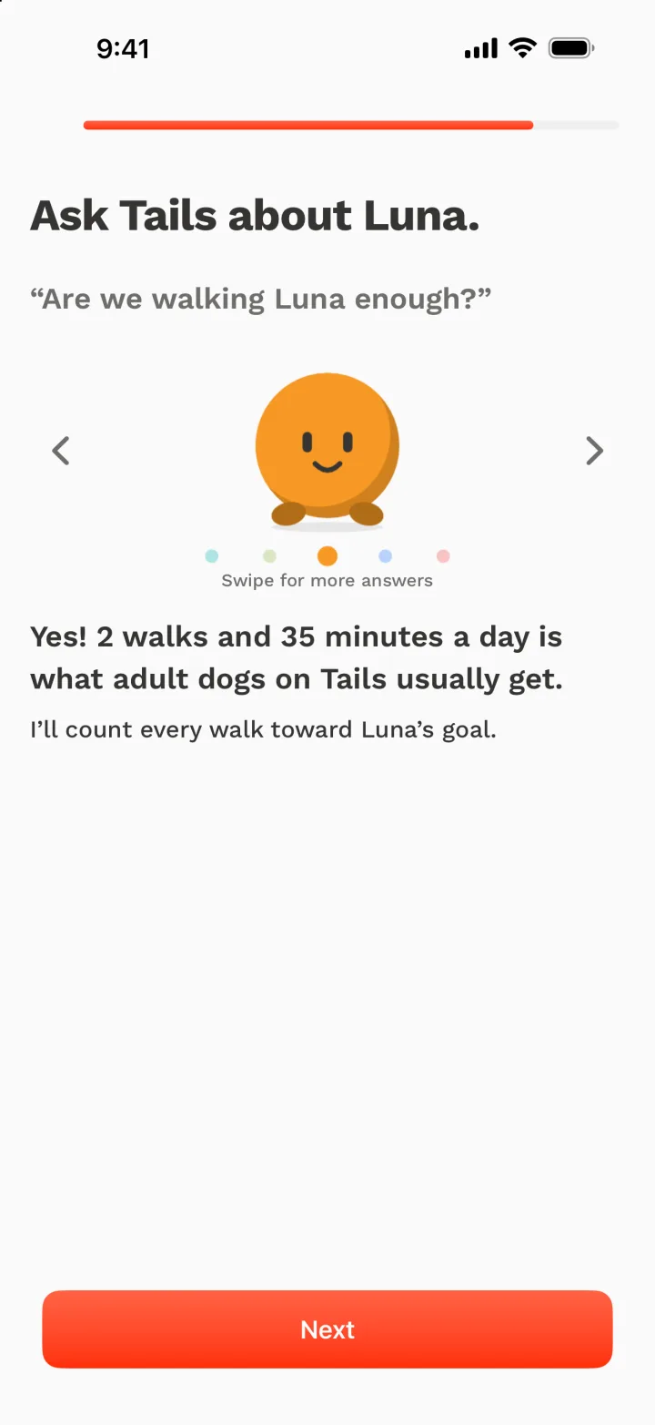
Ask Tails has a face made from the paw
Each of the paw’s five pads has its own shape and colour, and Ask’s face is one of them. The face follows the topic: ask about walks and it becomes the orange ball. The assistant picks the topic itself rather than matching keywords. In the tab bar it says hello once by rolling through all five, then only blinks now and then: alive, not busy.
Tried and dropped: A face that changed every second (busy). A flat brand-orange circle, which read as a second selected tab.
-
Answers come with a comparison
“Are we walking Luna enough?” gets a yes or no, then what adult dogs on Tails usually get. A number alone doesn’t help a pet parent decide anything.
Packs, and inside a Pack
“Which of my Packs are active this week, and where does my dog stand in each race?”
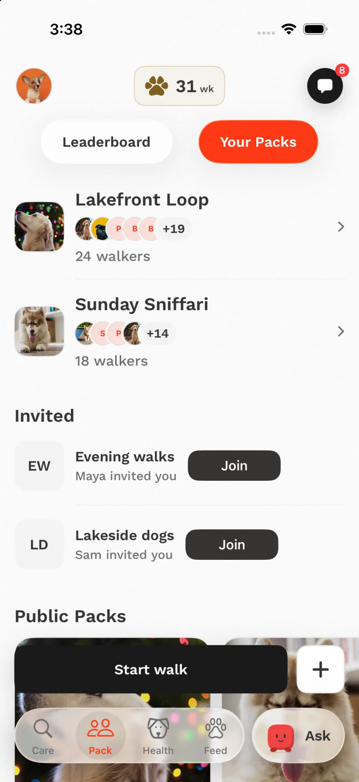
Packs are where competing happens: small groups with weekly challenges. Every walk you finish races the best walk in every Pack you’re in. There is nothing to start.
What’s on the screen
- Your Packs: photo, full name, faces of the dogs who walked this week, and how many walkers.
- Invitations, then Public Packs to join.
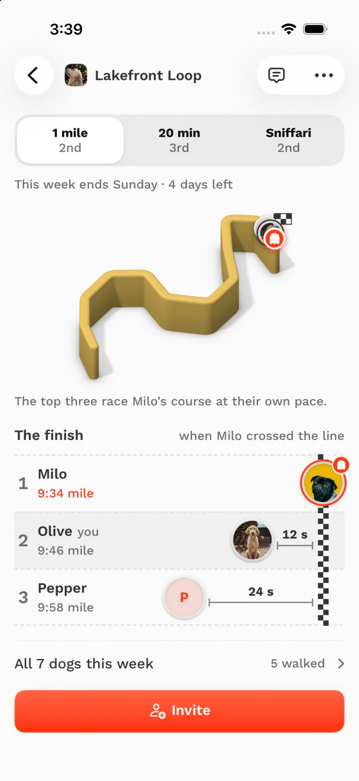
- Inside a Pack: a switch between its challenges, each showing your place.
- When the week ends, in words.
- The course of the walk to beat as a 3D route, then the finish line with the top three.
- Invite as the one action at the bottom.
Decisions
-
The tab answers “is this Pack alive?”
A pile of faces of who walked this week shows a busy group better than any single result. The order is fixed: photo, name, who walked, how many walkers. Names are never cut off.
Tried and dropped: A league table with your rank (one rank can’t sum up several challenges). Raw times like “9:34” on the tab: lots of reading, very little meaning.
-
Your place in every challenge, in the switch
Each segment names a challenge and your place in it (“1 mile · 2nd”). You can see where you stand everywhere before you choose one. It is a real switch, always visible, even when there’s only one challenge.
Tried and dropped: Challenge rows at the bottom of the page, and a swipe pager. Both hid the other races.
-
Show the gap as a finish line
The race is drawn as lanes crossing a checkered line. First place sits on the line, and the others sit back by how far they were behind: 12 s, 24 s. You see the gap before you read it, and you see what it takes to move up.
-
The course is the walk to beat
The 3D route is the course of the walk currently in first place, and the top three race it at their own pace. It makes a weekly time trial feel like a place you could go and walk.
-
Every walk counts automatically
There is no Chase button and nothing to opt into. A walk you were going to take anyway enters every race you’re in. The deadline is always Sunday, stated in words.
-
Sniffing adds up. It isn’t a race.
The Sniffari challenge counts the week’s total sniffing time across all walks, so a slow, nosy walk wins. It’s drawn as the week so far, day by day, not as a sprint.
Tried and dropped: Rings, minute dots and timelines of sniff stops. They borrowed track-meet metaphors for something that isn’t a race.
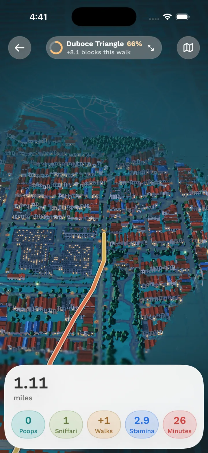
Live walk: the pixel world
“Where are we, how far have we come, and what is this walk adding to her health?”
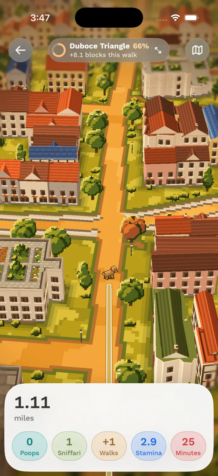
During a walk the phone is mostly in a pocket. When it comes out, it should feel like a reward: your dog walking through a miniature version of your real neighbourhood. One card underneath carries everything you need.
What’s on the screen
- The world: your real streets as a pixel-art miniature, with your dog walking the route.
- At the top: the neighbourhood you’re in, how much of it you’ve explored, and the new blocks this walk added.
- The card: distance, then what this walk is adding to each of the paw’s five measures.
- A map switch for a plain white map.
Decisions
-
Make the walk itself the adventure
People repeat the same loop. Showing how much of your neighbourhood you’ve explored (“66%”, “+8.1 blocks this walk”) gives a reason to turn down a new street, which is better for the dog’s nose too. Zoom out and the streets you haven’t walked yet are still under fog.
-
A diorama, judged as stills first
We wanted the tilt-shift look of a model town: pixel art, soft focus at the edges, a fixed chase camera above the dog. The first version was built object by object and fell flat. After that, every look was rendered as stills and compared with our references before any of it was built into the app.
Tried and dropped: A cel-shaded, outlined version. Trees looked good but roofs turned into fine stripes, so we kept pixels.
-
The light follows the real sun
An evening walk looks like evening: golden hour, then teal night with lit windows, street lamps and a warm glow around the dog. Seasonal palettes (a spring meadow and a fall storybook) are picked and being wired to the calendar.
-
A smooth route over pixel art
The route is drawn as a clean line, not pixels, and coloured by walking speed. The contrast in style keeps the one thing you need to find readable against a busy world.
-
Show what the walk feeds, not the score
The card shows the paw’s five measures in their usual colours: minutes and sniffing filling live, Walks +1 at the end. You can watch your walk count without a score jumping around mid-walk.
-
One card, in every state
Nothing stacks over the world. Tapping a measure turns the card into that measure’s page in place, and logging a pee is one tap. A finished walk opens in the same card, so a live walk and a past walk look the same.
-
Frame rate is part of the design
The world adjusts its detail to the phone, steps down before the phone gets hot, and treats a look it can’t hold as a bug. A beautiful screen that drains the battery on a 45-minute walk isn’t beautiful.
How we get to a decision
-
Questions, ranked
Each screen starts as a ranked list of the questions people open it to answer, not as a copy of the screen we already have.
-
Options, side by side
We draw three or more full-length options on one canvas next to what ships today, so they’re judged together at real size.
-
Built, then reviewed on a phone
The pick is built in the app and reviewed on a real device. Most of the decisions above came from a note on a screenshot.
-
Principles in one file, behaviour beside the code
Our design file holds principles and shared components only. Each screen’s behaviour lives next to its code, so a redesign isn’t treated as breaking a fixed spec.
Your turn
Pick a screen or a flow, criticize the design and the product, and send your draft with the reasoning behind it.